
The Problem
Gravity Forms lets you put fields side by side: drag one next to another, or set a field’s width in its settings. That layout works in rows. Fields on the same row line up, and the next row starts below the tallest field.
That’s a problem when one side is taller than the other. Say you want Name, Email, Phone and Company down the left, and a big message box on the right. With the built-in layout, the message box shares a row with Name, so there’s a big empty space under Name before Email starts.
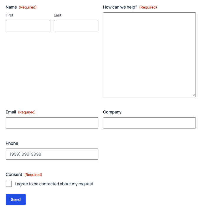
What you actually want is two columns: four fields stacked on the left, one tall field on the right, each column as tall as it needs to be.
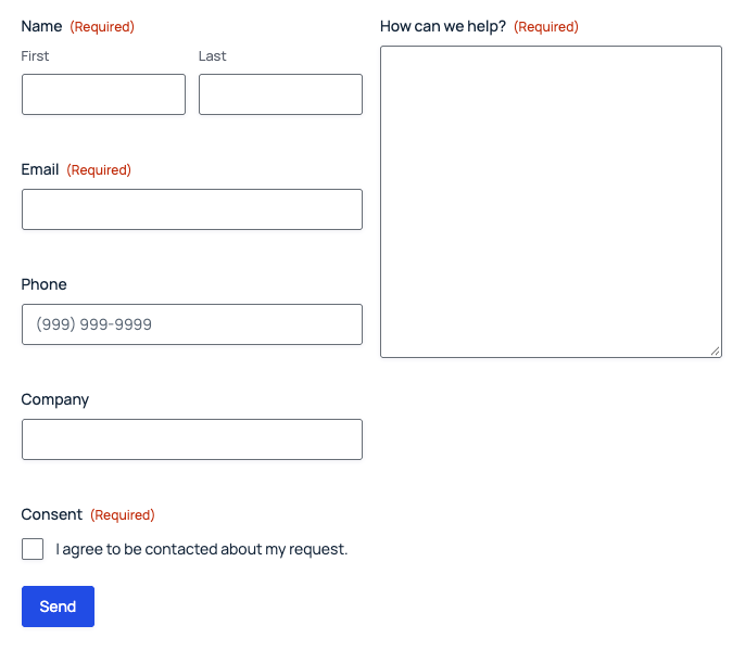
The Solution: Columns With HTML Fields
The idea is simple. You add an empty HTML field where a column starts and another where it ends. A short snippet swaps those two fields for an opening and closing <div>, so everything between them ends up in one column.
Because this happens on the server while the form is built, the columns are there the moment the page loads. They also stay in place after a validation error, including with AJAX turned on.
Step 1: Add the Snippet
Add this with a code snippets plugin (such as Code Snippets or WPCode), or in your theme’s functions.php:
/**
 * Swap the marker HTML fields for an opening or closing <div>.
 * The form is built as one string on the server, so everything between the two markers ends up inside the column.
 */
add_filter( 'gform_field_container', function ( $field_container, $field ) {
	if ( 'html' !== $field->type || GFCommon::is_form_editor() ) {
		return $field_container;
	}

	$classes = preg_split( '/\s+/', (string) $field->cssClass );

	if ( in_array( 'gr-column-start', $classes, true ) ) {
		$span = 6; // Half the form by default.
		foreach ( $classes as $class ) {
			if ( preg_match( '/^gr-column-(\d{1,2})$/', $class, $match ) ) {
				$span = max( 1, min( 12, (int) $match[1] ) );
			}
		}
		return '<div class="gr-column" style="--gr-column-span:' . $span . '">';
	}

	if ( in_array( 'gr-column-end', $classes, true ) ) {
		return '</div>';
	}

	return $field_container;
}, 10, 2 );

/**
 * The column CSS, added once to any page with a form.
 * Each column takes its share of the form's 12-column grid and is a 12-column grid itself,
 * so half-width fields still sit side by side inside a column.
 */
add_filter( 'gform_get_form_filter', function ( $form_string ) {
	static $printed = false;
	if ( $printed || false === strpos( $form_string, 'gr-column' ) ) {
		return $form_string;
	}
	$printed = true;

	$css = '
.gform_wrapper .gform_fields > .gr-column {
	grid-column: span var(--gr-column-span, 6);
	display: grid;
	grid-template-columns: repeat(12, minmax(0, 1fr));
	column-gap: var(--gf-form-gap-x, 2%);
	row-gap: var(--gf-form-gap-y, 16px);
	align-content: start;
}
@media (max-width: 640px) {
	.gform_wrapper .gform_fields > .gr-column {
		grid-column: 1 / -1;
	}
}';

	return '<style id="gr-form-columns">' . $css . '</style>' . $form_string;
} );
The first part turns the marker HTML fields into the column <div>s. The second part adds the CSS, once per page, only when a form uses columns.
Step 2: Add the Column Markers
For each column, add an HTML field before its first field and another after its last field. Leave the content empty, and give each one a label you’ll recognize in the editor, like “Left column start”. The labels never show on the form.
Then open each marker’s Appearance settings and set the Custom CSS Class:
gr-column-starton the field that opens a columngr-column-endon the field that closes it
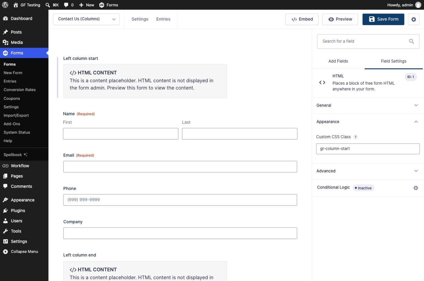
Here’s the field order for the contact form above:
| Field | Type | Custom CSS Class |
|---|---|---|
| Left column start | HTML | gr-column-start |
| Name, Email, Phone, Company | Your fields | |
| Left column end | HTML | gr-column-end |
| Right column start | HTML | gr-column-start |
| How can we help? | Paragraph Text (size Large) | |
| Right column end | HTML | gr-column-end |
| Consent | Consent |
Fields outside the markers, like the consent checkbox here, use the normal full-width layout.
Step 3: Set the Column Widths (Optional)
Columns are half the form wide by default. To change that, add a width class to the start marker, from gr-column-1 to gr-column-12. It works like Gravity Forms’ own 12-column grid, so two columns side by side should add up to 12.
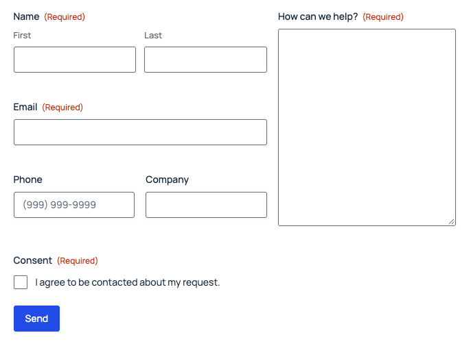
For a wider left column, use gr-column-start gr-column-7 on the left start marker and gr-column-start gr-column-5 on the right one.
Inside a column, the built-in layout still works. Here, Phone and Company are set to half width and sit side by side within the left column:
On Phones
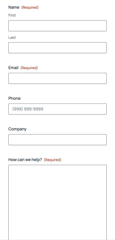
Below 640 pixels wide, the columns stack: the whole left column, then the whole right column. That’s the same point where Gravity Forms makes side-by-side fields full width.
Things to Know
- Every start needs an end. Close each column before you open the next one, and don’t put a column inside another column.
- Multi-page forms: keep a column’s start and end markers on the same page.
- Legacy markup: this relies on the CSS grid Gravity Forms has used since version 2.5. If a form still has Legacy markup turned on in its settings, turn it off.
- Nothing extra is saved. HTML fields don’t store a value, so the markers don’t show up in entries, notifications or exports.
- The form editor isn’t affected. In the editor the markers stay as normal HTML fields, so you can still drag fields in and out of a column.
Download the Form Template
It’s free. Get the form and the snippet from this tutorial, ready to import.
Need More Help?
If you still need help, use the chat or leave a comment below and we’ll get back to you.
Comments